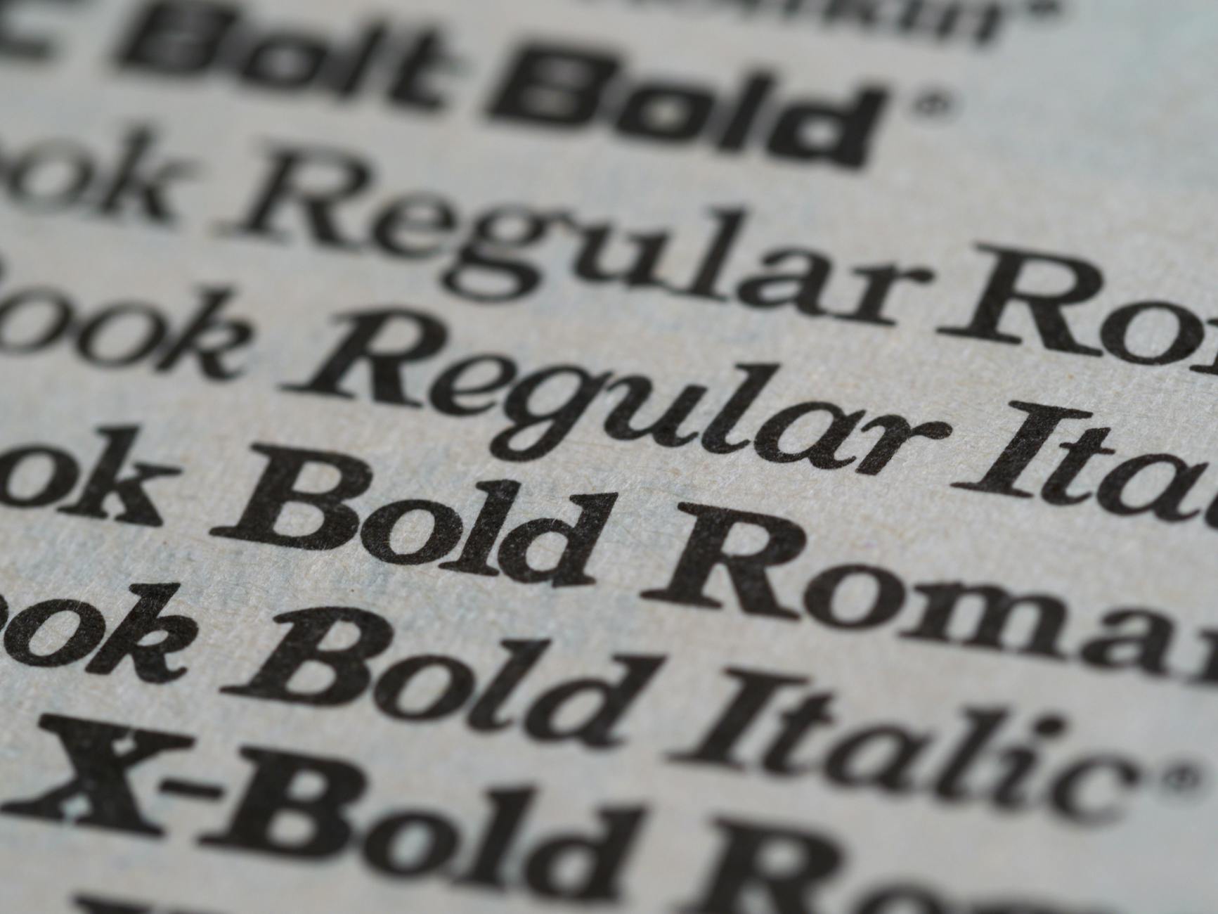
You've seen it a thousand times. That perfect font on a movie poster, a website, a product label. You need it. You want it. But what the hell is it called?
For designers, this is the everyday torment of a profession that lives and dies by typography. Google searches fail. Forums offer guesses. Someone suggests 'Comic Sans' as a joke and you want to throw your laptop out the window.
Enter Fonts In Use. Not a new tool, not a flashy startup, just a straightforward database that answers one deceptively simple question: where is a font actually used? No AI hype. No blockchain. No 'revolutionary' anything. Just a searchable archive of real-world typography.
The Anatomy of a Useful Obsession
The site works like this: you type in a font name, and it shows you examples of that font in the wild. A magazine spread here, a street sign there, a logo from 1972. Each entry is tagged, dated, and sourced. You can browse by format (book, web, film), by decade, or by industry.
It's obsessive in the best way. Someone spent hours cataloging the typeface used on a discontinued cereal box. Another person logged the font from a Soviet-era propaganda poster. Together, they've built a reference library that Google can't replicate because Google doesn't understand context.
The most valuable design tool isn't a tool at all. It's a reminder that every font has a history, a purpose, and a place where it just works.
This matters because typography is invisible when done right. You only notice a font when it's bad — when it's illegible, mismatched, or overused. Fonts In Use makes the invisible visible. It connects the abstract name on your font menu to the physical world of print and screens.
Why Designers Love It (And Why You Should Care)
If you're not a designer, you might wonder why this matters. But think about the last time you tried to describe a visual idea to someone. "Make it look like that old book cover, you know, the one with the serif font?" That's the problem Fonts In Use solves. It gives you a shared vocabulary.
For professionals, it's a shortcut through the noise. Instead of scrolling through 500 generic sans-serif options, you see how other designers solved the same problem. What font did NASA use for their 1970s manuals? What typeface defined the punk zine aesthetic? The answers are here, waiting.
The site also reveals how fonts age. Some look timeless. Others scream '2012 WordPress theme.' Seeing typography in historical context teaches you something about design trends that no textbook can.
The Quiet Rebellion Against Algorithmic Everything
Fonts In Use is a relic in the best sense. It's user-submitted, curated by humans, and doesn't try to predict what you want. There's no recommendation engine suggesting fonts based on your browsing history. No sponsored results. No AI generating fake examples that never existed.
This feels radical in 2026. Every other creative tool is racing toward automation. Canva wants to design for you. Adobe wants to generate your layouts. Fonts In Use says: here's what someone else did, now go think for yourself.
The site has a quiet, almost scholarly dignity. It doesn't beg for your attention. It doesn't sell anything. It just sits there, a massive index of visual culture, waiting for you to stumble upon it.
The Limits of the Archive
Of course, it's not perfect. The database is only as good as its contributors. Some fonts have dozens of examples; others have one blurry photo from 2008. If you're looking for the newest, obscurest typeface from a foundry in Berlin, you might come up empty.
And it can't tell you where to buy a font or how much it costs. That's not the point. This is a reference work, not a shopping mall. It's the difference between a library and a bookstore.
But for anyone who cares about visual communication, the gaps are part of the charm. They invite you to contribute. To add that font you spotted on a bus shelter. To document a piece of design history before it's painted over or deleted.
A Verdict on the State of Things
Fonts In Use reminds us that the best design tools are often the simplest. A search bar. A list of results. A community of people who care about the same obscure details.
In a world where every app wants to be your 'creative copilot,' sometimes you just want to know what font was used on the cover of a 1983 issue of National Geographic. That's not AI's job. That's a human obsession, cataloged for other humans.
So next time you see a font that stops you cold, don't Google it. Go to Fonts In Use. And if the answer's not there, add it. That's how we build culture, one character at a time.